
The designer of the four interconnected websites — China Heritage, China Heritage Annual, A New Sinology Reader and The Story of the Stone — reflects on his experience in creating these sites with the founders of The Wairarapa Academy, Geremie R. Barmé and John Minford, and the Stone scholar Annie Ren. — The Editor
Callum Smith
Designer, China Heritage
#bad_design { cursor: crosshair; }
According to Internet statistics analysts at MIT, by early 2016 there were over one billion unique websites on the Internet; Google and other search engines had indexed over one trillion webpages. The average Internet user visits fewer than one hundred websites a month. When visiting a site, a reader will generally skim under twenty percent of the site’s total content.
Although websites are an integral part of digital life, statistics show that most online content remains under-utilised or unexplored. Why is this?
There is no denying the fact that average users visit sites or use web apps for immediate and pragmatic reasons, or for instant gratification. Commercial sites and apps are created to provide ‘click bait’ and many achieve that aim seamlessly. But what of content-rich sites that languish in cyber purgatory: not entirely ignored nor ever fully utilised?
From my experience both as a web user (I’m twenty-three this year and started surfing the net at age five) and as a web designer (I created my first website at the age of ten), I would suggest that apart from simple utilitarian uses of the net, most websites even when they are designed for easy navigation and prolonged use (that is, to be ‘sticky’), reflect a disconnect between the aims of content providers and the designers they employ to help realise their online vision, or ‘web market model’. As a result, even professional or non-commercial sites are often ungainly and hard to navigate.
If websites are so important, why are they often so poorly designed, or fail to optimise content? With one billion other websites to contend with, why should anybody read yours?
Don’ts and Does
Websites are easy to make. Packaged solutions like WordPress provide the means by which even the least tech-savvy user can build their own website. Not surprisingly, most of the resulting sites end up looking generic, regardless of the intended purpose; they readily become cluttered with irrelevant elements and feature widgets-for-widgets’ sake. Once up and running, they are often not maintained and become ill-kempt. Amateur sites like these may be used for simple data mining; they are rarely fully explored or ever returned to, floating adrift in the gyre of the Internet, lost in a virtual Sargasso Sea. Professionally designed websites, however, might be aesthetically appealing, but their designers often have no involvement, or particular interest in, the content they are working with. The results of such a mismatch are evident everywhere.
Poorly designed websites are not only frustrating, they are counter-productive. Thoughtfully designed sites can be rich and varied. Clumsy and thoughtless sites are differently bad in pretty much the same way. They employ mundane and confusing formats. They are stylistically inconsistent, difficult to navigate, function poorly on mobile devices, and are unintuitive; they make excessive use of elements that serve no apparent function. In some cases, designers believe unconventional approaches make their sites ‘novel’ or ‘innovative’. More often than not, they deter potential readers, degrade the quality of the content, and present content authors as careless. Bad websites often share the following ten features. They:
- Use non-standard or inconsistent colour schemes, typefaces and sizing
- Bloat the page with irrelevant content, are over-complicated
- Make poor use of whitespace and space distribution
- Use an inconsistent layout between pages
- Have an arbitrary navigation style, and employ poorly designed site hierarchy
- Are not purpose-built and are designed inappropriately for the content type and theme
- Use an incoherent URL structure, unintuitive ‘breadcrumbs’ (a good breadcrumb, or URL design, would reflect the hierarchical position of the page, eg. chinaheritage.org/journal/essays/on-websites)
- Are incompatible with modern browsers and different platforms (i.e., mobile devices, tablets, desktop computers)
- Load slowly, require users to install plugins or load unnecessary resources (Flash movies, complex graphics)
- Are not well documented, are programmatically poorly constructed, and inhibit the participation of, and transition to new website developers
Such flaws result in cumbersome and illogical site designs and are detrimental to user experience. To my mind, a website is ‘well designed’ if it works in a way that fulfils user anticipation, or exceeds it, and if it is aesthetically pleasing. Although seemingly obvious, the primary consideration for an successful design is to determine how content and form can be aligned. The content — whether that be of an e-newspaper, digital news site, blog, app, e-commerce site, etc. — and the ‘tradition’ that the website builds on will determine basic design principles and functionalities.
As with any other publication, the design should be familiar, both aesthetically and hierarchically. A non-fiction book, for example, is divided into chapters and sections in a way that allows each logical entity to be read as an individual piece, but also as a component that threads together ideas and themes in the overarching work. A magazine, journal or newspaper is similarly divided into thematic sections, pages and columns, within which content is organised according to its relevance and relationship to other content.
Websites as Metaphor
At the same time, the website design should aim to incorporate new technologies and interactivity into the tradition that it inherits. Apple, for example, is a long-standing proponent of skeuomorphic design — that is, digital mimicry of familiar physical objects — in its software. In its design guidelines, Apple suggests:
When virtual objects and actions in an app are metaphors for familiar experiences — whether these experiences are rooted in the real world or the digital world — users quickly grasp how to use the app…. It’s best when an app uses a metaphor to suggest a usage or experience without letting the metaphor enforce the limitations of the object or action on which it’s based.
In making four interconnected websites — China Heritage, China Heritage Annual, A New Sinology Reader and The Story of the Stone — our aim was to develop a design that was both distinctive yet familiar; aesthetically pleasing and intuitive. We wanted the site to reflect a traditional reading experience, while introducing new levels of interactivity, inter-textuality and multi-layered design that digital media make possible. The ‘Heritage web stable’ builds on a history both of print and of online journal-style publications that goes back to 1995 (see below), and it has been designed with this tradition, theme and purpose in mind.
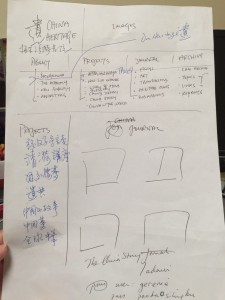
Structurally, the site has been organised in layers according to the regularity of content updates. The first stage of the drafting process was to determine what sections the site would comprise of, how those sections inter-relate, and their relative prominence. The wording and translations for each of these sections was carefully considered. Each ‘top level’ section uses either a single English word or two Chinese characters — the optimal length for screen sizes ranging from large desktops to smartphones. Although inevitably different from the final version, the initial draft provided the foundation on which the structure of the website was designed.
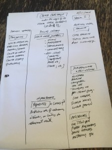
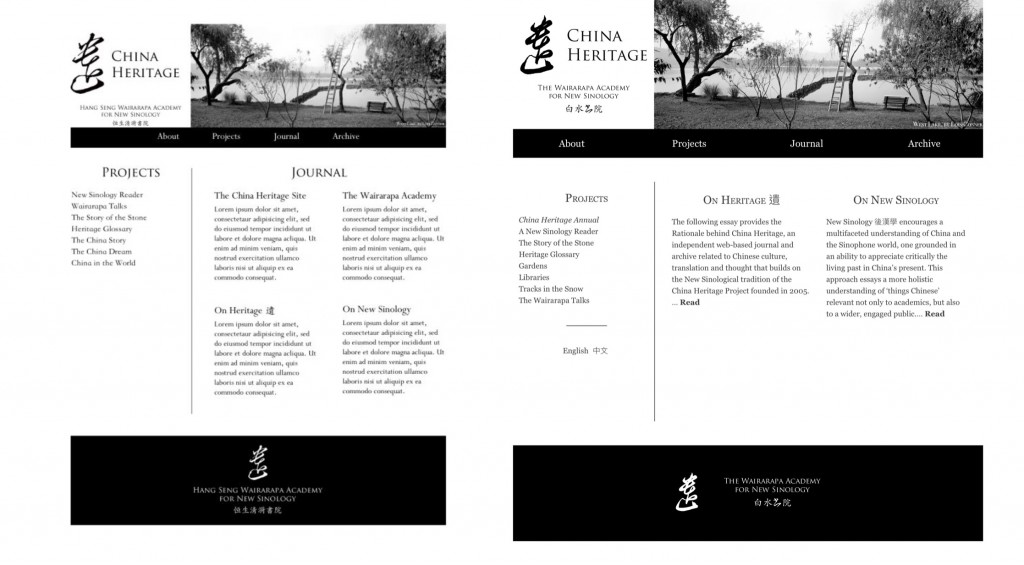
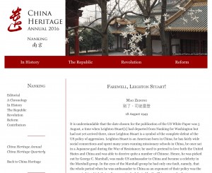
Based on this draft written plan, sketched out crudely on paper, a rough design for the website was put together in PDF format, one that took design cues from traditional print media. The layout was designed with general English-language print format and reading habits in mind — that is, from left-to-right and top-to bottom. The header — the most dominant component of every section of the site — establishes the ‘brand’ of the website, and sets the theme for the page being viewed. We selected the grass-script form of the character 遺 yí ‘heritage’ in the hand of Li Huailin 李懷琳 of the Tang dynasty as a motif for the Heritage ‘brand’, and photographic artwork by Lois Conner as the prominent banner. In Chinese, these two components are known as the ‘head’ 報頭 (‘flag’, or ‘nameplate’ in English) and ‘eyes’ 報眼 (or ‘ears’ in English) of the newspaper. The header provides the thematic basis for the minimalistic and tradition-inspired design. Variations made to the header are used to differentiate major sections of the site. The serif typefaces — Trajan for titles, Caslon for content and Huawen kaiti 華文楷體 for Chinese — and black-and-white primary colour schemes have been used as part of the overall tradition-inspired style.
#FFFFFF Paper Thinking
Using this basic structure and thematic motif, the first section to be drafted was the front page. The front page (or ‘home page’) of a website was once considered to be the most visited, and therefore the most important page. This is no longer the case. Search engines now index every section of a website guiding users to specific content; most users who visit the front page do so with the intention of quickly navigating to a more relevant part of the site. Poorly designed sites wastefully populate the front page with a slab of text ‘about this site’ or ‘how to use this website’. Instead, we conceptualised the front page of the main China Heritage site as serving a similar function to the front page of a newspaper. It should provide, at a glance, seamless navigation to other sections of the website, but also draw the reader’s attention to new content. To resolve this, we designed a prominent ‘top level’ navigation menu — ‘About’, ‘Projects’, ‘Journal’ and ‘Archive’ — for quick access to major sections of the website. These are further divided into sub-sections in drop-down menus. On the left side of each page, a contextual menu provides navigation between pages within the same section. In the main content area, excerpts from the four most recent journal articles are displayed. This introduces first-time users to the website and its content, as well as providing return readers with an overview of what has been added since their last visit. This basic layout is universal throughout the site.
Elements are sized and positioned according to their relative importance, prominence and recurrence. Each element of the design has been chosen to serve an obvious, familiar and unique purpose. Each page is divided into separate logical entities by means of white space. Many webpages divide individual elements — such as lists, or paragraphs — by using excessive amounts of blank space and make inconsistent or confusing use of division indicators, such as headings. This clutters the page unnecessarily, and makes content difficult to read. In order to determine the optimal amount of spacing between elements, and the precise positioning of those elements to form natural ‘lines’ on the screen, ‘mock’ designs were revised many times before any code was written and a ‘live’ site posted.
China Heritage was designed to look and function the same, regardless of the device used to view it: whether that be on a desktop, a touchscreen tablet or mobile phone. A similar, but distinct, conceptual design was drafted for various screen sizes and platforms. Elements are automatically rearranged and re-calibrated according to screen size. On desktops, menus respond to mouse events — such as clicks and hovers — while touch-screen devices, such as an iPhone or iPad, respond to a sequence of taps, in order to best adhere to the expected mode of interaction on each platform.
Sub-sites — that is, major sections of the site that warrant an independent navigational logic — are designed according to this basic layout, using contextual menus for deeper navigation within the sub-site. These sub-sites are distinguished by subtle variations on the standard page elements — such as the colour-scheme and the banner image.
Even within the deep layers of a ‘sub-site’ — for example, in an issue of the China Heritage Annual, or one of The Academician’s personal archives — the reader should be able to navigate seamlessly back to the main Heritage site. Although each of these sub-sites could be designed as an independent entity, this hierarchical design allows for a level of integration and unity that would not be possible if each sub-site were designed separately.
Superficial Depths
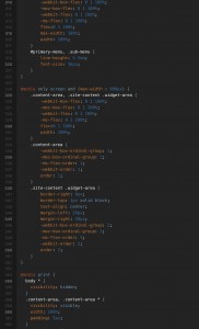
As new technologies become available and site content evolves websites are invariably revised and redesigned. Over the initial design period (March-July 2016), layout of China Heritage was repeatedly tested, reviewed and revised as content was added. Shortcomings become evident as elements fell into place and began to feel ‘right’. This process of revision and improvement will continue for as long as China Heritage exists. This is why the site is designed to be modular — that is, content and design are distinct and independent. This allows for the seamless integration of future changes to the layout, style and functionality of the site. The design, scripts and other server-side code unique to the site are internally documented, to allow anyone with a basic understanding of website development languages to participation in the further design and development of the site.
Designed under the guidance of Geremie R. Barmé (a writer who has worked on various websites since co-building with his colleagues at the Long Bow Group in Boston The Gate of Heavenly Peace site to accompany the film of the same name in 1995), China Heritage is the product of a minimalist, purpose-built approach to intuitive website design. Other content types would require design principles different from those described here. Irrespective of genre, one basic rule of web design applies: the function of any element should never be confusing, or unexpected. The design should encourage reading, not deter it. Webpages are more likely to be read when their purpose is obvious, content is relevant, and they are easy to navigate and use. Impatience and skim reading are habits that need to be understood and accommodated, in particular as they are likely to become even more prevalent among web users and with the gradual transition towards primarily smartphone and tablet based web-browsing.
Technologies change with time, as do user habits and expectations. China Heritage was designed, coded and written primarily on an iPad Pro — unimaginable when the first generation of that device was launched in 2010 — even today a cause for ridicule among path-dependent, conservative programmers and designers. Websites that are designed to attract users and readers and that aim to remain relevant should anticipate, accommodate and embrace the kinds of changes to habits and technologies described in the above. At the same time, they will also inevitably evolve as new content and reader/user responses clarify their purpose, and their possibilities.